What began as a hastag on twitter, has now evolved into movement. With the recent protests over systemic racism shooting across the US, I was naturally curious to see what the movement was all about.
In this project, I attempt to take data from various public sources and visualize the effects of systemic racism on different races living in the United States.
In Part 1 of this project, we would be looking at the most prominent cause of the movement - Police shootings
We have data on all deadly police shootings between 2013 and 2019. The goal is to analyze the data and derive any trends that could be indicative of systemic racism. We will be looking at what other factors may have played a part in the shootings and combining other sources of data to this analysis.
Initialization
First of all, we import the libraries we will use, configure some settings, and load the dataset.
#Defining libraries
import pandas as pd
import numpy as np
import seaborn as sns
import os
from sklearn import linear_model, metrics
import matplotlib
import matplotlib.pyplot as plt
from collections import Counter
# Notebook display config
pd.options.display.max_rows = 30
sns.set(style="white")
Loading the data from https://mappingpoliceviolence.org/
#Getting police shootings data from https://mappingpoliceviolence.org/
mpv_police_dataset = pd.read_excel('MPVDatasetDownload.xlsx')
#Looking at the data
mpv_police_dataset.head()
| victim_name | victim_age | victim_gender | victim_race | url_vitcim_image | date_of_incident | incident_address | city | state | zip | ... | mental_illness | unarmed | alleged_weapon | alleged_threat_level | fleeing | body_cam | wapo_id | off_duty_killing | geography | id | |
|---|---|---|---|---|---|---|---|---|---|---|---|---|---|---|---|---|---|---|---|---|---|
| 0 | Eric M. Tellez | 28 | Male | White | https://fatalencounters.org/wp-content/uploads... | 2019-12-31 | Broad St. | Globe | AZ | 85501.0 | ... | No | Allegedly Armed | knife | other | not fleeing | no | 5332.0 | NaN | Rural | 7664 |
| 1 | Name withheld by police | NaN | Male | Unknown race | NaN | 2019-12-31 | 7239-7411 I-40 | Memphis | AR | 38103.0 | ... | No | Unclear | unclear | other | NaN | NaN | NaN | NaN | Urban | 7665 |
| 2 | Terry Hudson | 57 | Male | Black | NaN | 2019-12-31 | 3600 N 24th St | Omaha | NE | 68110.0 | ... | No | Allegedly Armed | gun | attack | not fleeing | no | 5359.0 | NaN | Urban | 7661 |
| 3 | Malik Williams | 23 | Male | Black | NaN | 2019-12-31 | 30800 14th Avenue South | Federal Way | WA | 98003.0 | ... | No | Allegedly Armed | gun | attack | not fleeing | no | 5358.0 | NaN | Suburban | 7662 |
| 4 | Frederick Perkins | 37 | Male | Black | NaN | 2019-12-31 | 17057 N Outer 40 Rd | Chesterfield | MO | 63005.0 | ... | No | Vehicle | vehicle | attack | car | no | 5333.0 | NaN | Suburban | 7667 |
5 rows × 27 columns
Dataset cleaning
Now, we will check the consistency of the dataset, looking for not valid values (NULL, NaN) or duplicates
print("Any Null ?: ", mpv_police_dataset.isnull().values.any())
print("Any NaN ?: ", mpv_police_dataset.isna().values.any())
Any Null ?:  True
Any NaN ?:  True
We are seeing some null values show up. We will proceed to clean up the data by eliminating some columns with the most amount of null entries and see if we can clean up some fields that are essential to our analysis.
#looking at the fill rate for each column
mpv_police_dataset.isna().sum()
victim_name                0
victim_age                67
victim_gender              8
victim_race                0
url_vitcim_image        3462
date_of_incident           0
incident_address          83
city                       6
state                      0
zip                       39
county                    15
death_agency              16
cause_of_death             0
brief_description         20
official_disposition     256
criminal_charge            0
news_link                 12
mental_illness            11
unarmed                    0
alleged_weapon             0
alleged_threat_level    2382
fleeing                 2616
body_cam                2869
wapo_id                 2785
off_duty_killing        7437
geography                 67
id                         0
dtype: int64
As per our analysis, we see that we need to eliminate the following columns: - url_vitcim_image - wapo_id
We will also be cleaning up the following columns:
- victim_age - converting all unknown ages to mean age
- victim_gender - converting nulls to unknown
- official_disposition - Convert all null values to pending investigation
- alleged_threat_level - Convert all null values to unknown
- fleeing - convert null and O values to unknown
- body_cam - convert all null values to unknown
- off_duty_killing - convert all null values to no
#first creating a master sheet with only the needed columns
master_sheet = mpv_police_dataset[['victim_name', 'victim_age', 'victim_gender', 'victim_race',
       'date_of_incident', 'incident_address', 'city','state', 'zip', 'county', 'death_agency',
       'cause_of_death','brief_description', 'official_disposition', 'criminal_charge','news_link',
        'mental_illness', 'unarmed', 'alleged_weapon','alleged_threat_level', 'fleeing', 'body_cam',
                                   'off_duty_killing', 'geography', 'id']]
#Cleaning up the victim age data
master_sheet = master_sheet.loc[(master_sheet.victim_age != 'Unknown') & (master_sheet.victim_age != '40s')]
master_sheet['victim_age'] = master_sheet['victim_age'].astype(float)
#Dealing with missing AGE values. Set them to mean of all ages.
master_sheet.victim_age.fillna(value=master_sheet.victim_age.mean(), inplace=True)
master_sheet.victim_age = master_sheet.victim_age.astype(int)
#cleaning up the other data
master_sheet.victim_gender.fillna(value= 'Unknown', inplace=True)
master_sheet.official_disposition.fillna(value= 'unknown', inplace=True)
master_sheet.alleged_threat_level.fillna(value= 'Unknown', inplace=True)
master_sheet.fleeing.replace(0, np.nan, inplace=True)
master_sheet.fleeing.fillna(value= 'Unknown', inplace=True)
master_sheet.body_cam.replace('no', 'No', inplace=True)
master_sheet.body_cam.fillna(value= 'Unknown', inplace=True)
master_sheet.off_duty_killing.fillna(value= 'Unknown', inplace=True)
Further Cleanup
Now we convert the incident date to datetime and look at the race data
#looking at the incident date and dividing it into year, month and month-year combo
master_sheet['date_of_incident'] = pd.to_datetime(master_sheet['date_of_incident'])
master_sheet['incident_year'] = master_sheet['date_of_incident'].dt.year
master_sheet['incident_month'] = master_sheet['date_of_incident'].dt.month
master_sheet['incident_month_year'] = master_sheet['date_of_incident'].dt.to_period('M')
#visualizing distribution based on race & seeing if the data needs to be cleaned up.
master_sheet['victim_race'].value_counts()
White               3359
Black               1928
Hispanic            1307
Unknown race         619
Asian                118
Native American      109
Pacific Islander      42
Unknown Race          42
Name: victim_race, dtype: int64
#cleaning up unknown race data
master_sheet.loc[master_sheet.victim_race == 'Unknown Race', 'victim_race'] = "Other"
master_sheet.loc[master_sheet.victim_race == 'Unknown race', 'victim_race'] = "Other"
Additional Data
Adding race based population to add enhanced layer of detail to our analysis
#adding the total population by race for US: from https://en.wikipedia.org/wiki/Demography_of_the_United_States
conditions = [master_sheet["victim_race"]=="Asian", master_sheet["victim_race"]=="White",
              master_sheet["victim_race"]=="Hispanic", master_sheet["victim_race"]=="Black",
              master_sheet["victim_race"]=="Native American", master_sheet["victim_race"]=="Other"]
numbers = [14674252, 223553265, 50477594, 38929319, 2932248, 22579629]
master_sheet["total_population"] = np.select(conditions, numbers, default="0").astype(int)
Also adding a column to keep count of victims (useful in complex group by statements) and a column to visualize each death per million people of that particular race in the country (useful in determining per capita deaths)
master_sheet['victim_count'] = 1
master_sheet['death_per_mil'] = master_sheet['victim_count'] * 1.0 /master_sheet['total_population'] * 1000000
Data Visualization
We will look at visualizing different aspects of the data to look for trends. Here, we will be plotting different types of graphs to understand the data better.
Victim Name
Starting with looking at the name of the people who were killed in the police shootings:
#creating a seperate sheet and creating a count vector for both names and surnames combined.
separate = master_sheet.victim_name[master_sheet.victim_name != 'Name withheld by police'].str.split()
a,b = zip(*separate)      #a=name b=surname
name_list = a+b
name_count = Counter(name_list)
most_common_names = name_count.most_common(15)
x,y = zip(*most_common_names)
x,y = list(x),list(y)
# Plotting the graph of the 15 most common names and surnames based on victim_name
plt.figure(figsize=(15,10))
ax= sns.barplot(x=x, y=y,palette = sns.cubehelix_palette(len(x)))
plt.xlabel('Name / Surname of killed people')
plt.ylabel('Frequency')
plt.title('Top 15 Name or Surname of killed people')
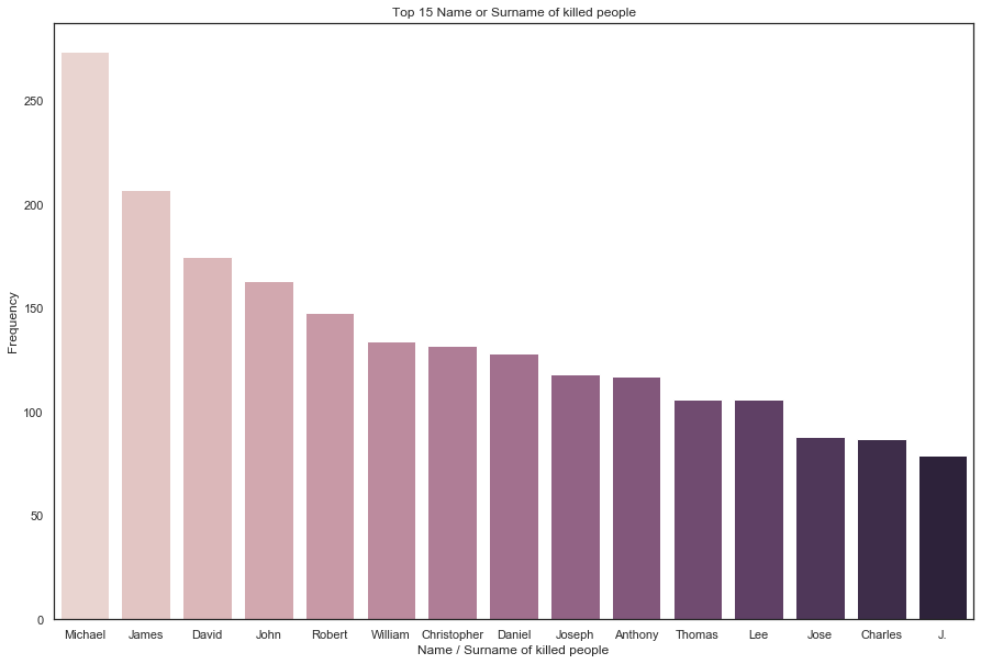
Here we can see the most common names are Michael & James -- with over 500 people with these 2 names being killed.
Victim Race
Looking at the victim race data
#visualizing distribution based on race
master_sheet['victim_race'].value_counts()
White               3359
Black               1928
Hispanic            1307
Other                661
Asian                118
Native American      109
Pacific Islander      42
Name: victim_race, dtype: int64
As the number of Asians, Native Americans and Pacific islanders seems very low, we will take them out for the sake of continuing with our analysis as there could be multiple anomalies there.
#creating a new dataframe where race is either black white or hispanic
master_sheet_race = master_sheet.loc[master_sheet.victim_race != 'Other']
master_sheet_race = master_sheet_race.loc[master_sheet_race.victim_race != 'Asian']
master_sheet_race = master_sheet_race.loc[master_sheet_race.victim_race != 'Native American']
master_sheet_race = master_sheet_race.loc[master_sheet_race.victim_race != 'Pacific Islander']
Looking at the total number of people killed by race:
#Plotting total number of people killed by race
plt.figure(figsize=(15,5))
sns.countplot(data=master_sheet_race, x="victim_race")

plt.title("Total number of people killed, by race", fontsize=17)
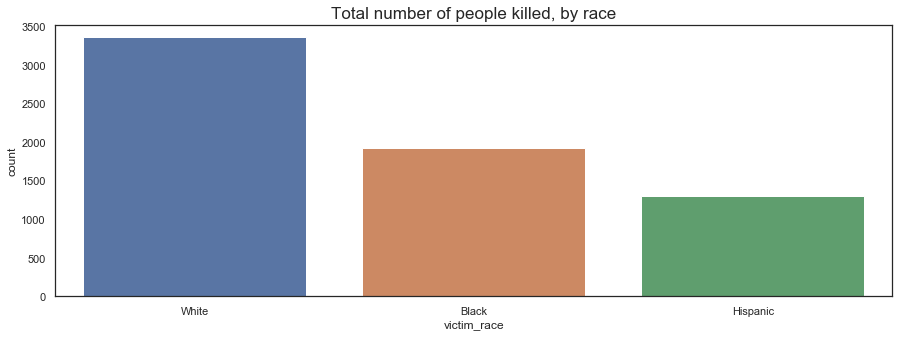
This graph shows us a partial picture, as the number of white people killed to be seems a lot higher than black and hispanic people. We then include the overall population of each race and compare the number of people killed per million people of the race.
We will be using this method going forward for our other analysis as well.
Looking at the counts of people killed per million:
#creating a new dataframe to capture total number of deaths per million
race_based_counts = pd.DataFrame(master_sheet_race[['victim_race', 'victim_count', 'total_population', 'death_per_mil']]
                    .groupby(['victim_race', 'total_population']).sum().reset_index())
#looking at the data
print(race_based_counts)
  victim_race  total_population  victim_count  death_per_mil
0       Black          38929319          1928      49.525654
1    Hispanic          50477594          1307      25.892676
2       White         223553265          3359      15.025502
#Visualizing people killed per million people based on race
plt.figure(figsize=(14,6))
plt.title("People killed as a proportion of their respective race per million", fontsize=17)
sns.barplot(x=race_based_counts.victim_race, y=race_based_counts.death_per_mil)
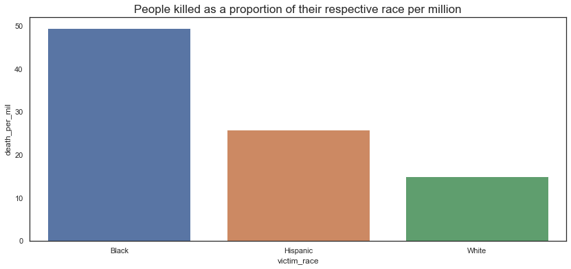
First signs of racism?
Here, we start seeing a very different tale. By the counts of it, a black person is 3 times more likely to be killed as compared to a white person. Similarly, a black person is twice as likely to be killed as compared to a hispanic person.
Looking at deadly police shootings over time
Looking further to see how the police shootings have progressed over the last 7 years. - Here, we plot the number of people killed (per million) over the last 7 years.
#creating time specific instances to visualize race based shootings by time
race_killings_per_mil = pd.DataFrame(master_sheet_race[['incident_month_year','incident_year',
                                                        'victim_race', 'victim_count', 'death_per_mil']]
                        .groupby(['incident_month_year','incident_year', 'victim_race']).sum().reset_index())
#Plotting the number of people per million who get killed per year
plt.figure(figsize=(20,10))
(race_killings_per_mil[['incident_year', 'victim_race', 'death_per_mil']]
 .groupby(['incident_year', 'victim_race'])
 .sum()
 .unstack()
 .plot.bar()
)
plt.title("People killed in police shootings per 1M people per year: by race over time", fontsize=17)
plt.show
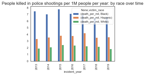
This graph shows what was earlier visualized in the overall chart, that there is definitely focus on the race of a person. Here, we can see that we have atleast 7 black people per million being killed in police shootings per year.
Checking for seasonality
Seeing if there is any effect of certain months over time on the number of shootings
First looking at overall number of shootings per month per race.
#plotting the shootings per month over time
plt.figure(figsize=(500,300))
(master_sheet_race
 .groupby(['incident_month_year', 'victim_race'])
 .size()
 .unstack()
 .plot.line()
)
plt.title("People killed in police shootings per month: by race over time", fontsize=17)
plt.show
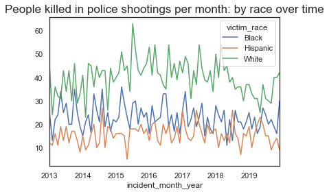
While we see some dips in the data, there is no indication of seasonality based on the number of people killed per month. We will now look at the same kind of graph to visualize death per million
#plotting the vicitms per 1M population per month over time
plt.figure(figsize=(500,300))
(race_killings_per_mil[['incident_month_year', 'victim_race', 'death_per_mil']]
 .groupby(['incident_month_year', 'victim_race'])
 .sum()
 .unstack()
 .plot.line()
)
plt.title("Deadly shootings per 1M people per month: by race over time", fontsize=17)
plt.show
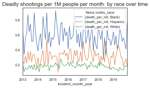
Here, we observe a slight dip in the percentage of people being killed around the end/start of the year -- especially for black people. This is an interesting observation and we will note it down to see if there is any more data around this and if this can be explored further.
Victim Age
Looking further at the age of people killed and visualizing any trends based on the data
#Plotting the age of all people killed in our dataset
plt.figure(figsize=(15,7))
age_dist = sns.distplot(master_sheet_race['victim_age'], bins=40)
age_dist.set(xlabel="Age", ylabel="Count")
plt.title("People killed in police shootings: Age distribution", fontsize=17)
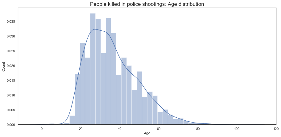
Here, we see that the majority of people killed are between the ages of 20 - 45 for all populations.
Looking further at the ages for all races to see if there are any differences.
#based on the count of people killed by age, we come up with custom bins to analyze the victim age data further
bins = [0, 13, 18, 22, 25, 30, 35, 40, 45, 50, 55, 60, np.inf]
names = ['0-13', '13-18', '18-22', '22-25', '25-30', '30-35', '35-40', '40-45', '45-50', '50-55', '55-60', '60+']
master_sheet_race['victim_age_range'] = pd.cut(master_sheet_race['victim_age'], bins, labels=names)

#Plotting the age of all people killed based on race
plt.figure(figsize=(14,6))
(master_sheet_race
 .groupby(['victim_age_range', 'victim_race'])
 .size()
 .unstack()
 .plot.bar()
)
plt.title("People killed in police shootings: by race over age", fontsize=17)
plt.show
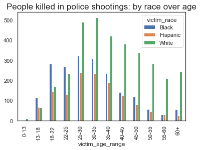
Indication of Racism?
Here, we can clearly see that the majority of black and hispanic people killed in police shootings are between the ages of 18 - 35, whereas, for white people, this age is between 25 - 45. This indicates a definitive prevalance of race based differentiation
Looking further into the shootings by age, but focusing on the number of people per million killed in that age group
#creating time specific instances to visualize race based shootings by time
race_killings_per_mil = pd.DataFrame(master_sheet_race[['victim_age_range','incident_year',
                                                        'victim_race', 'victim_count', 'death_per_mil']]
                        .groupby(['victim_age_range','incident_year', 'victim_race']).sum().reset_index())
#Plotting the number of people per million who get killed per age group
plt.figure(figsize=(14,6))
(race_killings_per_mil[['victim_age_range', 'victim_race', 'death_per_mil']]
 .groupby(['victim_age_range', 'victim_race'])
 .sum()
 .unstack()
 .plot.bar()
)
plt.title("Killings per 1M people per year: by race over age groups", fontsize=17)
plt.show
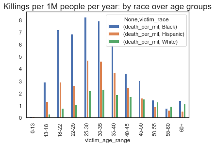
This is where the disparity really starts to show. Based on the graph, a black person between the ages of 22-25 is 7 times more likely to be killed in a police shooting as compared to a white person in the same age group.
We also see that a black person between the ages of 13-18 is 10 times more likely to get killed as compared to a similar aged white person.
Location Data
Looking at location based data to identify the deadliest states and cities. We also look to see if race plays an impact on certain cities.
Starting with Police shootings by state:
#Plottings the number of police shootings by state
plt.figure(figsize=(14,10))
sns.countplot(data=master_sheet_race, x=master_sheet_race.state)
plt.title("Number of police shootings, by state", fontsize=30)
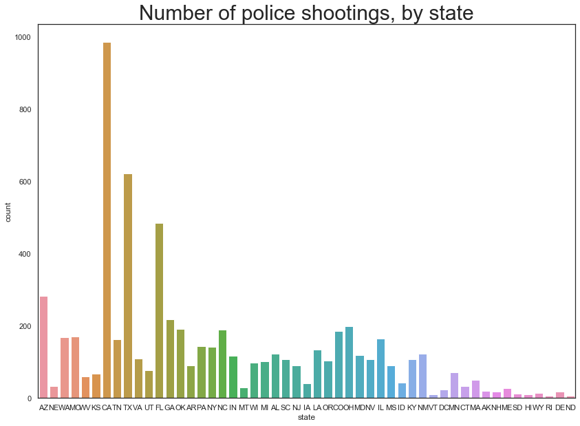
Here we can see that the states of CA, TX and FL seem to have the most number of shootings.
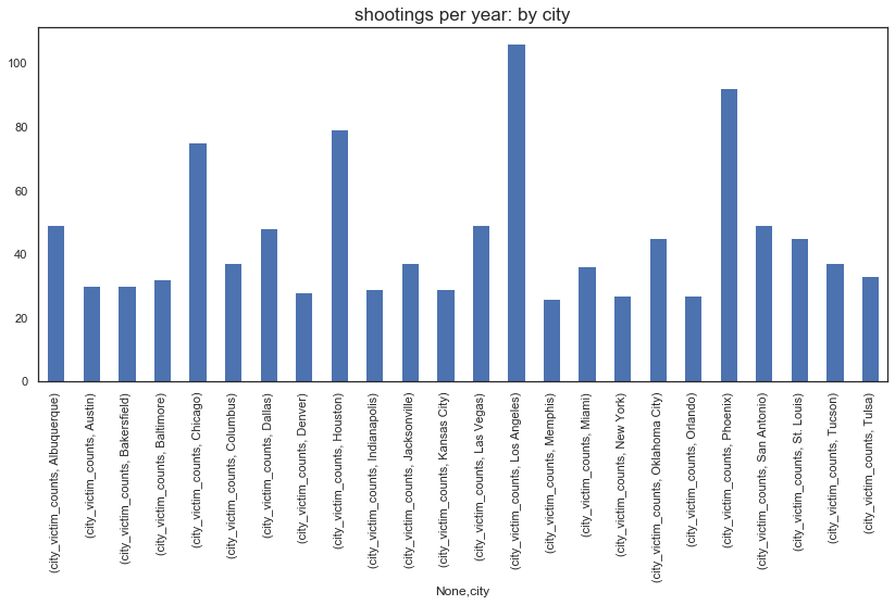
Looking further to a city level
#looking at city based data and identifying the deadliest cities -- based on which cities have more than 25 victims
deadly_city_info = pd.DataFrame(master_sheet_race[['city','state', 'victim_race', 'victim_count', 'death_per_mil']]
                        .groupby(['city','state', 'victim_race']).sum().reset_index())

deadly_city_info['city_victim_counts'] = deadly_city_info.groupby(['city','state'])['victim_count'].transform('sum')

deadly_city_info = deadly_city_info.loc[deadly_city_info['city_victim_counts'] > 25]
#Plotting the number of people killed per city in our list of deadliest cities
plt.figure(figsize=(14,6))
(deadly_city_info[['city', 'city_victim_counts']]
 .groupby(['city'])
 .first()
 .unstack()
 .plot.bar()
)
plt.title("shootings per year: by city", fontsize=17)
plt.show
Going further and seeing if we can get the race based count on a city level:
#See if we can get the race based census data at city level
deadly_city_info2 = deadly_city_info.loc[deadly_city_info['city_victim_counts'] > 25]
#Plotting the number of people per million who get killed per age group
plt.figure(figsize=(14,6))
(deadly_city_info2[['city', 'victim_race', 'victim_count']]
 .groupby(['city', 'victim_race'])
 .first()
 .unstack()
 .plot.bar()
)
plt.title("Shootings per year: by race over city groups", fontsize=17)
plt.show
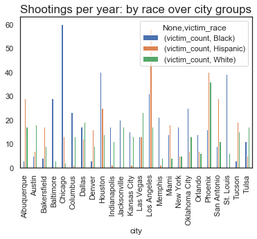
Here, we look at the cities with the most disparate count of shootings and the ones that immediately stand out:
- Chicago, Baltimore, St.Louis, Oklahoma & Houston - places with clear disparity in majority black people being victims in police shootings.
- Los Angeles, San Antonio, Miami, Alberquerque - places with clear disparity in majority hispanic people being victims in police shootings.
- Las Vegas, Austin, Tulsa - Only deadly cities where majority of poeple killed in police shootings were white
Doing a similar analysis on police departments responsible for shootings
#Looking at the police department responsible for deaths and seeing if any police department stands out
deadly_police_depts = pd.DataFrame(master_sheet_race[['death_agency','victim_race', 'victim_count']]
                        .groupby(['death_agency', 'victim_race']).sum().reset_index())

deadly_police_depts['pd_victim_counts'] = deadly_police_depts.groupby(['death_agency'])['victim_count'].transform('sum')

deadly_police_depts = deadly_police_depts.loc[deadly_police_depts['pd_victim_counts'] > 30]
#Plotting the number of people per race who get killed based on police department
plt.figure(figsize=(14,6))
(deadly_police_depts[['death_agency', 'victim_race', 'victim_count']]
 .groupby(['death_agency', 'victim_race'])
 .first()
 .unstack()
 .plot.bar()
)
plt.title("Shootings by race over police department", fontsize=17)
plt.show
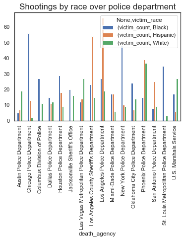
The police departments that have a heavy impact of race are as follows:
- Chicago PD, New York PD, Houston PD, St. Louis Metro PD, Oklahoma Pd : Higher ratio of black people killed as compared to other races
- LA County Sherrif's Dept, LAPD, Phoenix PD : Higher ratio of hispanic people killed as compare to other races
- Austin PD, Las Vegas Metro PD, U.S Marshals Service : Higher ratio of white people killed as compare to other races
Visualizing other fields
Looking at corelation of race against cause of death, alleged weapon, mental illness and geography
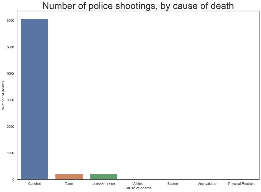
#Looking at the cause of death data now
cause_death = master_sheet_race['cause_of_death'].value_counts()
#plotting the most common ways of people getting killed
plt.figure(figsize=(14,10))
sns.barplot(x=cause_death[:7].index,y=cause_death[:7].values)
plt.ylabel('Number of deaths')
plt.xlabel('Cause of deaths')
plt.title("Number of police shootings, by cause of death", fontsize=30)
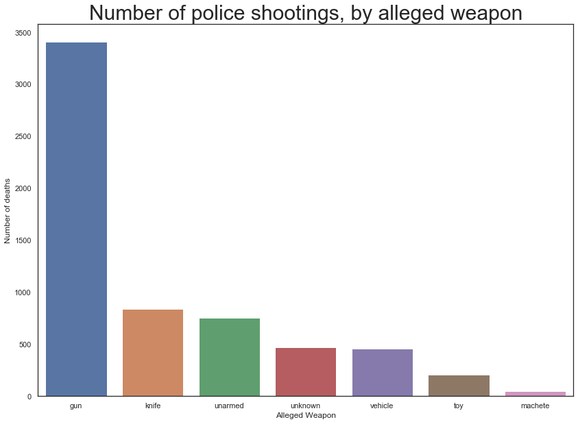
##Cleaning up alleged weapon data plotting distribution of alleged weapon amongst the victims
master_sheet_race.alleged_weapon = master_sheet_race.alleged_weapon.str.strip()
master_sheet_race.loc[master_sheet_race.alleged_weapon == 'unknown weapon', 'alleged_weapon'] = "unknown"
master_sheet_race.loc[master_sheet_race.alleged_weapon == 'unclear', 'alleged_weapon'] = "unknown"
master_sheet_race.loc[master_sheet_race.alleged_weapon == 'undetermined', 'alleged_weapon'] = "unknown"
master_sheet_race.loc[master_sheet_race.alleged_weapon == 'toy weapon', 'alleged_weapon'] = "toy"
weapon = pd.DataFrame(master_sheet_race['alleged_weapon'].value_counts().reset_index())
weapon.columns = ['alleged_weapon', 'victim_count']
#plotting the most common ways of people getting killed
plt.figure(figsize=(14,10))
sns.barplot(x=weapon[:7].alleged_weapon,y=weapon[:7].victim_count)
plt.ylabel('Number of deaths')
plt.xlabel('Alleged Weapon')
plt.title("Number of police shootings, by alleged weapon", fontsize=30)
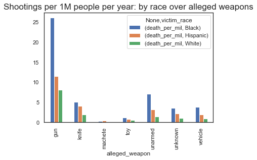
#plotting the number of deaths per million based on the alleged weapon
plt.figure(figsize=(14,6))
(temp_master[['alleged_weapon', 'victim_race', 'death_per_mil']]
 .groupby(['alleged_weapon', 'victim_race'])
 .sum()
 .unstack()
 .plot.bar()
)
plt.title("Shootings per 1M people per year: by race over alleged weapons", fontsize=17)
plt.show
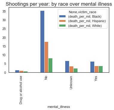
#looking at mental illness data to see if there is any distinction based on race
#cleaning up mental illness data first
master_sheet_race['mental_illness'] = master_sheet_race['mental_illness'].str.strip()
master_sheet_race.loc[master_sheet_race.mental_illness == 'Unkown', 'mental_illness'] = "Unknown"
master_sheet_race.loc[master_sheet_race.mental_illness == 'unknown', 'mental_illness'] = "Unknown"
#plotting the number of deaths based on mental illness
plt.figure(figsize=(14,6))
(master_sheet_race[['mental_illness', 'victim_race', 'death_per_mil']]
 .groupby(['mental_illness', 'victim_race'])
 .sum()
 .unstack()
 .plot.bar()
)
plt.title("Shootings per 1M people per year: by race over mental illness", fontsize=17)
plt.show
master_sheet_race[['geography','victim_race','victim_count']].groupby(['geography','victim_race']).count().unstack()
| victim_count | |||
|---|---|---|---|
| victim_race | Black | Hispanic | White |
| geography | |||
| Rural | 194 | 155 | 1078 |
| Suburban | 879 | 692 | 1714 |
| Urban | 838 | 455 | 540 |
Continuing along the trend we have observed so far, there seems to be a prevalant bias when looking at figures per million people.
We also observe that disparity is more in urban areas, with a majority of shootings involving black people.
Part 1: Conclusion
In the first part of our BLM project, we were able to visualize all the data that we had gathered regarding the police shootings. We can see that there is a significant amount of visible bias being given to the race when it comes to police shootings with black & hispanic people being significantly more likely to be killed in a police shooting as compared to white people.
Part 2: Sneak Peak
In part 2 of our BLM Project, we would be getting data from different sources and looking at correlation between things like the median household income, the race based count for each city, while also looking at the population of people over different cities so we could get per capita killings. Stay Tuned!
Comments
comments powered by Disqus